

STORIES WE’VE TOLD
Core and Motion
THE STORY
Core and Motion Physiotherapy came to Priism on the back of a brand name change. The brief was simple in principle and significant in scope: build a brand from the ground up that told the complete story of the heart behind the service from business cards and brochures to signage.
To build a recognisable, modern brand story, we started with developing a complete brand kit including a wholistic logo system, typography, colour palette, graphic element application and brand personality. Bearing in mind this had to be a flexible suite ready for everything from signage to socials, we outlined usage guidelines for the array of filetypes and applications we would apply the system to.
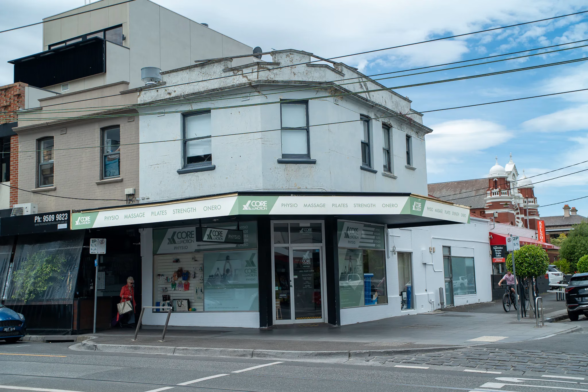
To bring it all to life, the rubber really hit the road when we put the brand kit to work in real-world application. We designed and deployed a signage system for both the Malvern and Brighton East clinics, rolled out branded collateral including business cards, letterheads, brochures and posters, and captured premises photography across both sites documenting the clinics, the practitioners, and the patient experience to give Core and Motion a complete brand story alongside a visual archive for future use.
“We had to rebrand from scratch at very short notice after exiting our corporate group, and Priism Creative delivered every step of the way from logos, colours and signage to developing our website, with genuine care and professionalism. Couldn't recommend them highly enough for any business going through a major brand transition.“
Shiv P. - DIRECTOR OF core and motion


The Challenge
A company name change meant Core and Motion needed more than a new logo, they needed an entirely new visual identity the felt unique to them, that could carry their clinical expertise and movement-focused approach across every touchpoint, from the front door of two clinics to the cards in a practitioner's pocket.
The Solution
Priism developed a full brand identity system: a production-ready logo suite with multiple lockups and formats, a colour palette and typography system anchored around the brand keywords professional, personal, expertise, support and wellbeing, and clear guidelines for consistent use. We then followed through with the deployment of our concepts and rolled the identity out into signage for the Malvern and Brighton East clinics, designed a suite of branded collateral, and captured premises photography to bring the new brand to life in real spaces with real people.
Outcomes
Core and Motion now has a complete, cohesive brand system that represents who they are and effectively tells their brand story. From logo files to signage to a library of on-brand photography, ready to support every part of the business, in clinic and online. The identity feels professional and modern while staying approachable, giving the practice a confident, consistent presence across digital and physical touchpoints alike.
Why choose priism?
“Josh and the team took the time to genuinely understand who we are as a practice and what we wanted our brand to say — not just slap a generic template on us. They worked through multiple concepts with us patiently, took our feedback (including plenty of changes of mind) in stride, and consistently turned things around quickly even when we were up against tight deadlines. From the logo and colour scheme through to shopfront signage, print collateral, social media assets and our new website, every piece felt considered and cohesive.
What stood out most was how reliable and easy they were to deal with throughout — clear communication, fair pricing, and a genuine investment in getting it right rather than just getting it done. Two years on, we're still coming back to them for new collateral and photography, which says a lot. If you're a business facing a rebrand, especially under pressure, Priism Creative is who you want in your corner.“
Shiv P. - Director of Core and Motion