

STORIES WE’VE TOLD
LAIDLAW EQUIP
↩ see all case studies
Amplified brand applications for INDUSTRY supplier
2024-Present
THE STORY
Laidlaw Equip came to Priism with an existing logo that wasn't quite working across the range of places it needed to live. As an industry supplier attending conferences, sending emails and putting branding on embroidered apparel, the mark needed to hold up at every size and in every context, and the original version wasn't built with that flexibility in mind.
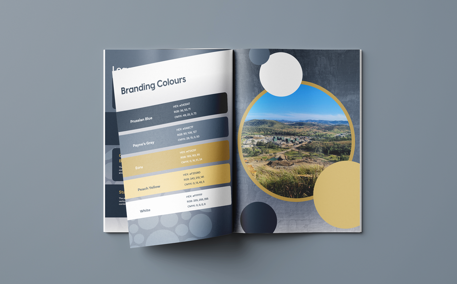
We expanded the brand into a full logo system, developing white and navy versions to solve for readability across different backgrounds, and splitting "Laidlaw Equip" into two words to make the name easier to read and recognise at a glance. We also built a simplified icon variant of the main circular mark, stripping back the detail so it stays crisp and legible at small print sizes, on embroidery, and as a favicon, all things the original logo struggled with.
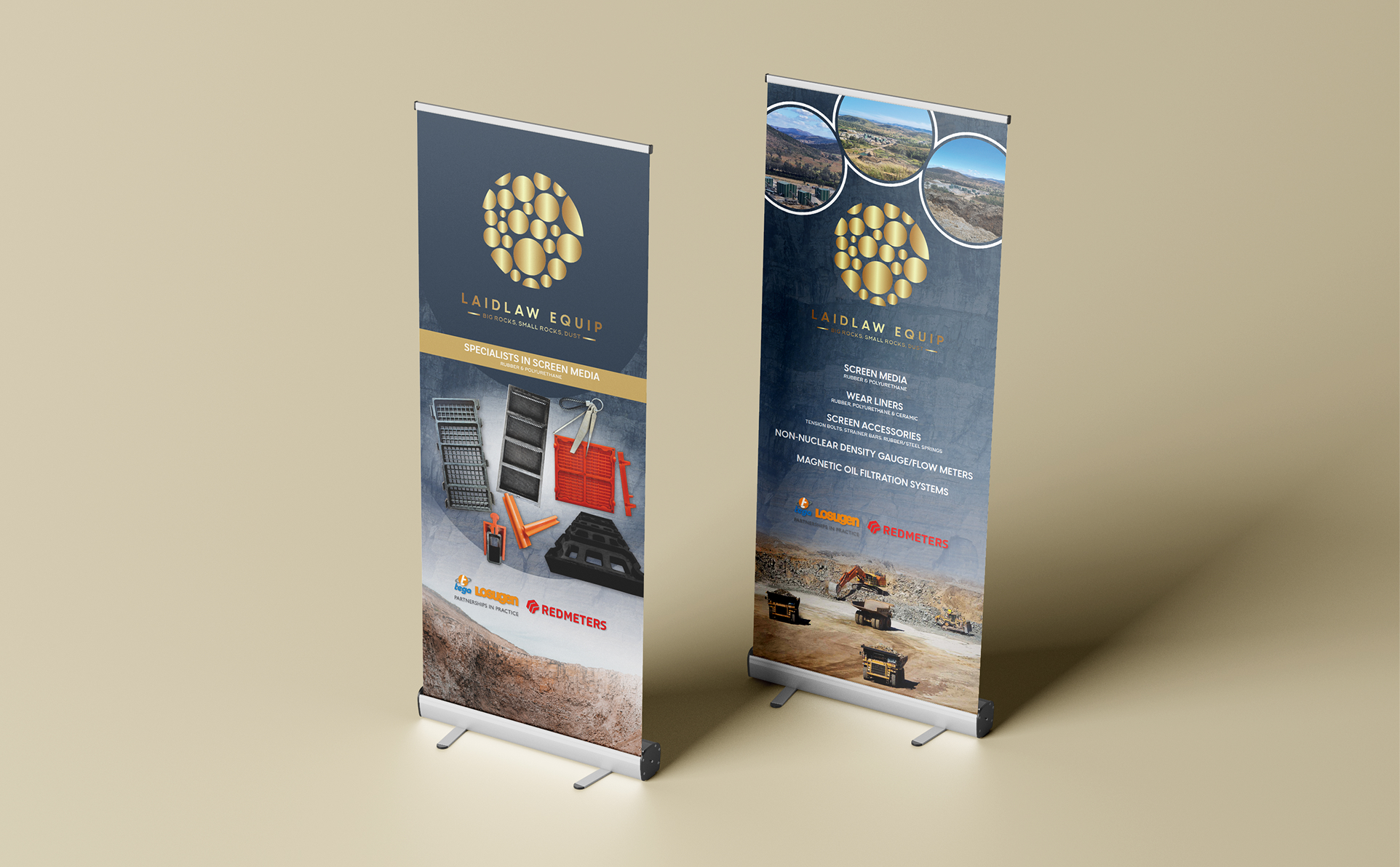
With that foundation in place, we've supported Laidlaw Equip with a steady stream of ad-hoc collateral, including Zoom and desktop wallpapers, seasonal LinkedIn posts and business cards. We also designed multiple pull-up banners for conferences and industry events, giving the team a clear, consistent way to present their service offering and product range on the trade show floor.
The Challenge
Laidlaw Equip's existing logo hadn't been built to handle the variety of places a supplier brand actually needs to show up: small print runs, embroidery, favicons, event signage and everything in between. Without a flexible system behind it, the mark risked losing legibility exactly where it needed to work hardest.
The Solution
Rather than starting from scratch, we worked from what already existed and built out the flexibility it was missing. Splitting the wordmark into two words solved a readability issue at its source, while developing simplified and colour-alternate versions meant the team always had the right variant on hand for whatever application came up, instead of forcing one version of the logo to do every job. For the conference banners, we treated each one as a chance to lead with the product range and service offering clearly, since that's what actually gets read on a busy trade show floor.
Outcomes
Laidlaw Equip now has a logo system built to work everywhere the brand needs to appear, from embroidered apparel to favicons to large-format event signage. That flexibility has made it easier to keep the brand consistent across the steady flow of ad-hoc requests, from LinkedIn posts to business cards, and the conference banners have given the team a clear, professional presence at industry events that properly reflects their range.