


STORIES WE’VE TOLD
Neuro Empowerment Solutions
↩ see all case studies
strategic User experience for NEUROEMPOWERMENT
2026
THE STORY
Neuro Empowerment Solutions began as a new brand built around the work of Aisling Smith, an established speaker and neurodiversity advocate stepping into a dedicated organisation of her own. The challenge was less about starting from nothing and more about giving an existing personal brand a structure that could stand on its own, while staying true to the mission behind it: making workplaces genuinely work for neurodivergent minds.
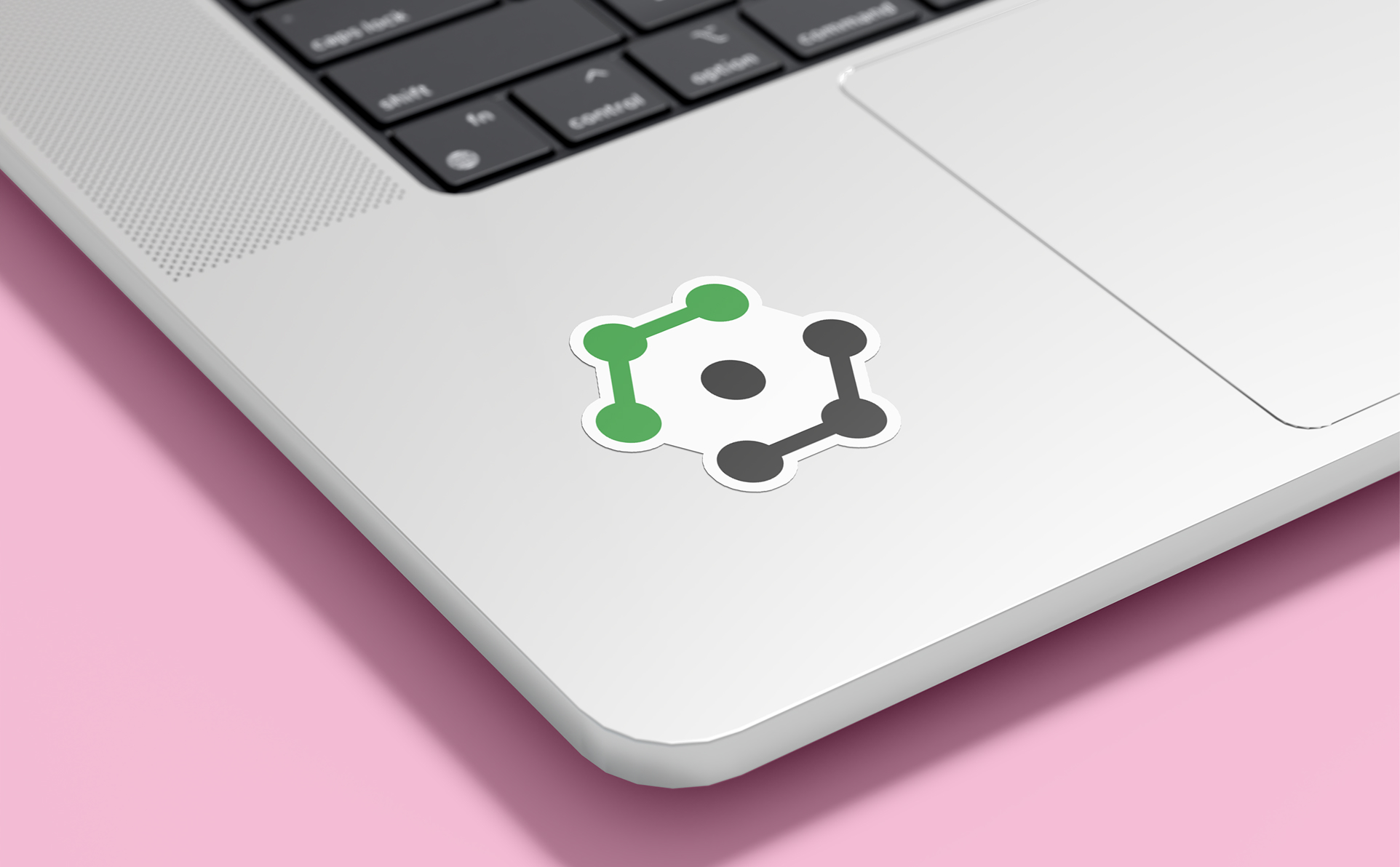
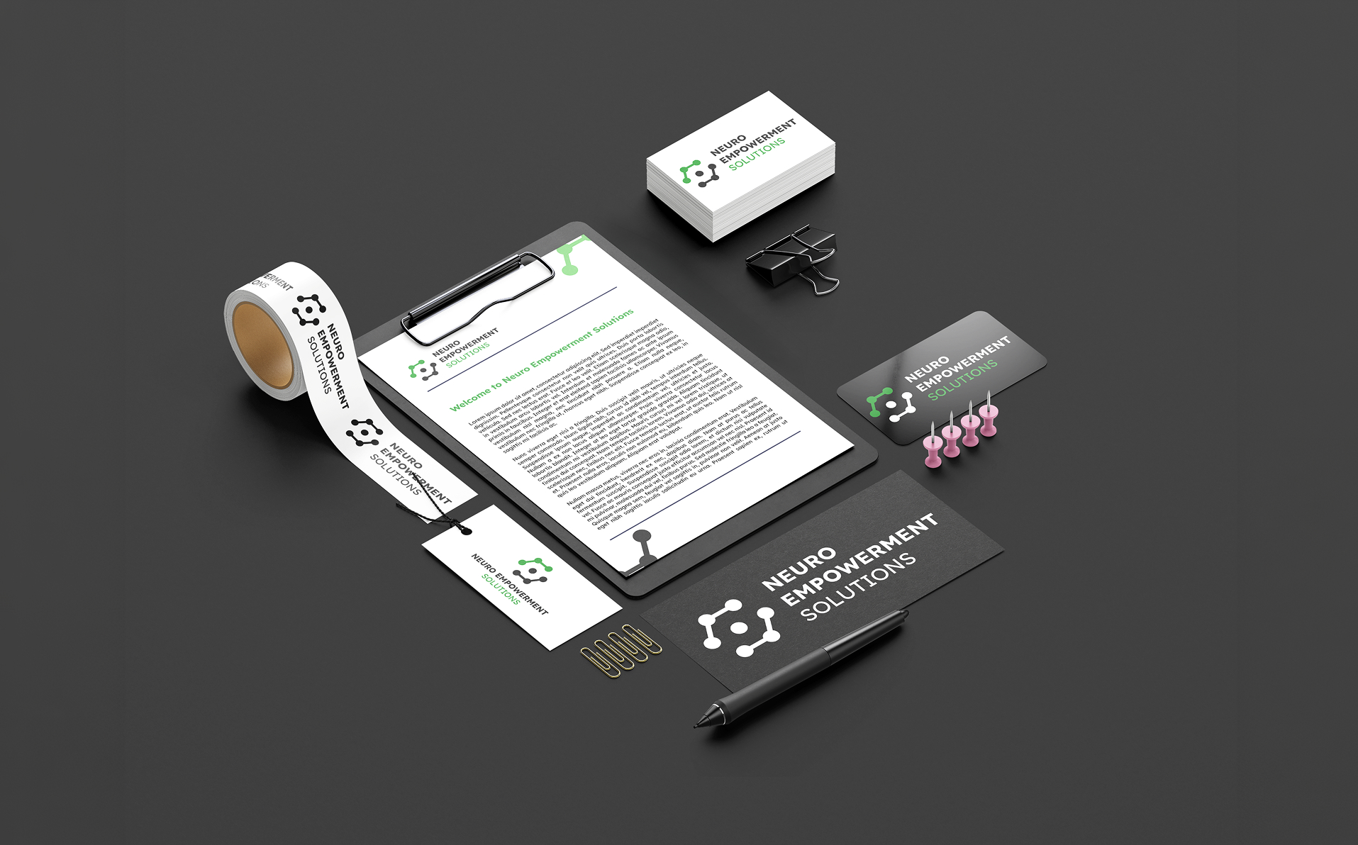
We designed a mark that captured the core of that mission, then built it out into a full logo system supported by an in-depth brand guidelines document. Accessibility sat at the centre of every decision, from selecting Lexend as the primary typeface for its legibility, to setting out WCAG-compliant colour combinations across the palette, ensuring the brand itself modelled the inclusive standards Neuro Empowerment Solutions advocates for.
The website was built from the ground up around that same principle. The audience skews toward executives with limited prior exposure to neuroinclusion, so we focused on a clear, uncluttered user experience and reworked dense, jargon-heavy language into something genuinely approachable, all while keeping the needs of neurodivergent staff front of mind in the layout and structure itself. Across both the brand and the website, we integrated a five-senses design approach, weaving in textures and patterns that carry through visually online while also mapping out how smell, sound and taste could reinforce the brand in physical settings, building a positive emotional association with the mission beyond what visuals alone can achieve.
“thank you so much for the incredible work, insights, dedication and above and beyond approach you took for us in all aspects of this project. I am so very impressed and have never worked with a more brilliant branding and website crew. Bravo. Please be proud of this and how well you translated our thoughts and wants into brilliant design for a significant portion of the market which is under seen and under valued.“
Jennifer c. - Business development manager
The Challenge
Aisling needed a brand that could carry an established personal reputation into a standalone organisation, without losing what made her voice resonate in the first place. The subject matter itself added another layer of complexity: the brand needed to speak confidently to executive decision-makers while genuinely reflecting the accessibility and inclusion principles at the heart of the work, rather than just referencing them in the messaging.
The Solution
We treated accessibility as a design constraint from the very first sketch, which shaped everything from typeface selection through to colour palette and contrast ratios. For the website, understanding the dual audience mattered most: executives needed confidence and clarity, while the experience itself had to genuinely accommodate neurodivergent users, so we simplified navigation and rewrote technical language into something a first-time visitor could absorb without feeling talked down to.
The five-senses concept came from wanting the brand to be felt rather than just seen, so we mapped out sensory touchpoints, textures on screen, scent and sound for in-person events, that could extend the brand experience well beyond a logo and colour palette.
Outcomes
Neuro Empowerment Solutions launched with a brand and website that reflect the same principles the organisation exists to promote: genuinely accessible, considered, and built around real human experience rather than convention. The client's own feedback called out the depth of thought behind the project, and the results speak to a brand that resonates with executive decision-makers while staying authentic to the community it was built to serve.