


STORIES WE’VE TOLD
RECOLAND
↩ see all case studies
CAPTURING THE CULTIVATION OF STUNNING LANDSCAPES
2025-Present
THE STORY
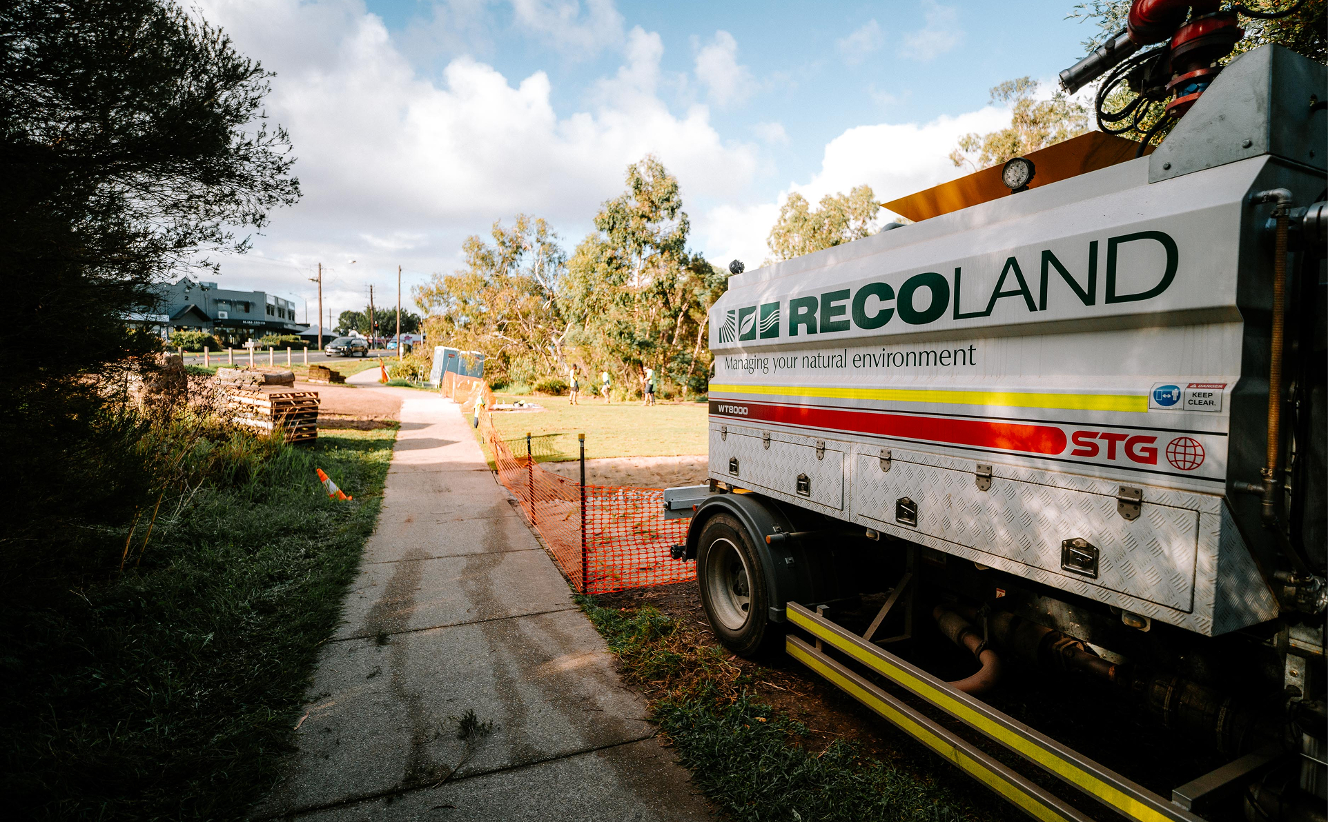
Recoland approached Priism needing a brand presence that matched the scale and professionalism of their environmental and civil works. We started with media capture, spending time on-site across their landscaping and construction projects to build a library of authentic photography showing their team and machinery at work in the field.
From there, we took on a full brand refresh, recreating their logo assets and building out a complete visual identity including a defined colour scheme, typography system and supporting patterns, all documented in a clear set of usage guidelines so the brand could be applied consistently across every future touchpoint.
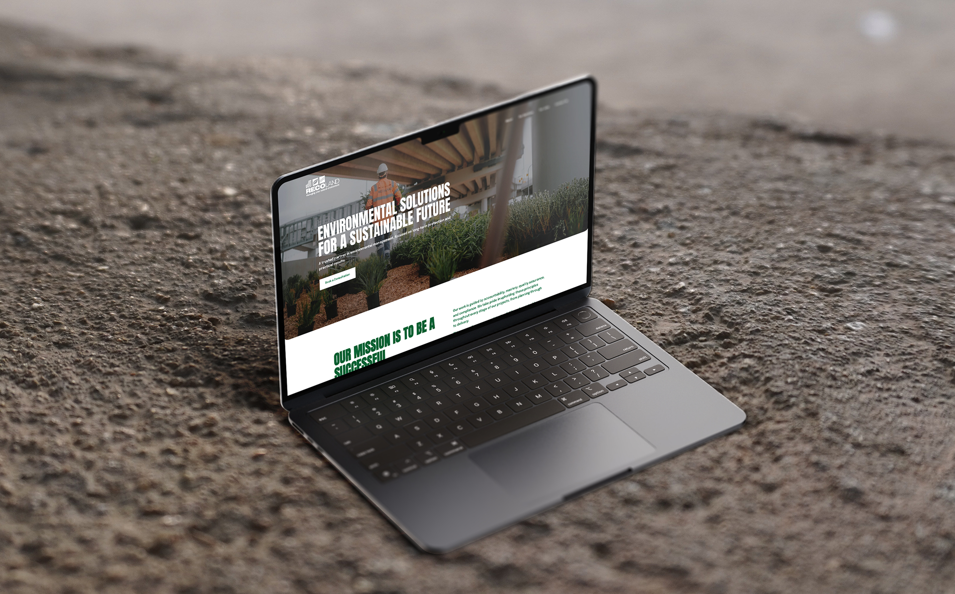
With the new brand foundation in place, we redesigned their website to properly reflect the quality of their work, giving Recoland a digital presence that matches the professionalism they bring to every job site.
The Challenge
Recoland's on-the-ground work spans landscaping, civil works and environmental solutions, but their brand and website hadn't kept pace with the calibre of the projects they were delivering. They needed a visual identity that felt professional and cohesive, backed by imagery that actually reflected the work, along with a website that could do it all justice.
The Solution
Our work with Recoland started on-site rather than at a desk, spending time capturing their crew and machinery in action to inform our design. That on-the-ground understanding shaped the identity that followed: we recreated the logo assets and built a colour, typography and pattern system designed to feel as solid and professional as the work itself, backed by clear usage guidelines so the brand could be applied consistently by the Recoland team going forward.
Once that foundation was in place we began their website redesign, ensuring the new site was built around a brand that had already been proven out across other materials rather than designed in isolation.
Outcomes
Recoland now has a professional, cohesive brand identity supported by clear usage guidelines, along with a website and photo library that genuinely reflect the quality of their work. The refreshed presence gives them a stronger footing to win new projects and present themselves with confidence across every touchpoint, from site to screen.